A construction project runs on documents that have to be exactly right: the subcontract for that scope, the change order for that revision, the lien waiver in that state, in that form, at that stage. The correct document is dictated by the contract, the trade, and the jurisdiction — not by judgment. That is the work a deterministic, rule-based document engine is built to take over.
DocupletionForms takes one intake of project and party data, applies conditional logic to decide which documents the job needs — by contract type, trade, and state — merges the data in, and delivers the finished set to your construction-management platform for signature and filing. The same inputs always produce the same documents, with no AI guessing in the path. This guide lays out the options: what feeds the engine, what it produces, and which platforms it can exchange with.
A note on scope. The connections below are suggested integration patterns, not pre-built one-click connectors for every platform named. DocupletionForms ships live bidirectional webhooks, a Salesforce add-on, and Zapier support (including multi-document output), and its role here is document generation for commercial, business-to-business paperwork — proposals, subcontracts, change orders, lien waivers, closeout packages. Several platforms also include their own document tools and e-signature; the value DocupletionForms adds is conditional, multi-document selection across the whole project. Confirm the specifics for any platform — especially how a finished PDF is delivered — before relying on a single path.
The shape of a construction document workflow
Every pattern here follows the same spine. Project and party data arrives from a management platform, an accounting tool, or an intake form. Rules decide which documents the job needs for that contract type, trade, and state. The data is merged in. The finished files go to the management platform for signature and filing, and status flows back to the platform and the accounting tool. The deterministic middle is what keeps lien waivers, subcontracts, and change orders correct every time — which, in construction, is the difference between getting paid and not.
Project / platform / accounting data
→ rule-based document selection
→ merge and populate
→ deliver to the management platform
→ e-sign, then update accounting
Where the data comes from
The inputs drive selection, so the more structured the source, the less anyone touches the documents afterward. Useful sources include:
- The DocupletionForms intake form. The primary driver. Project type, contract type (fixed-price, time-and-materials, cost-plus), trade and scope, state, and party tier (general contractor or subcontractor) are exactly what the conditional logic keys on.
- The management platform itself, as a source. A system (linked below) can push project, vendor, and cost data into DocupletionForms to pre-fill and select, then receive the finished documents back.
- Accounting — QuickBooks, Stripe. Construction lives in QuickBooks; contract values, draw amounts, and vendor data feed pay applications, lien waivers, and invoices.
- Field documentation — CompanyCam. Job-site photos and checklists that attach to daily logs, closeout packages, and completion documents.
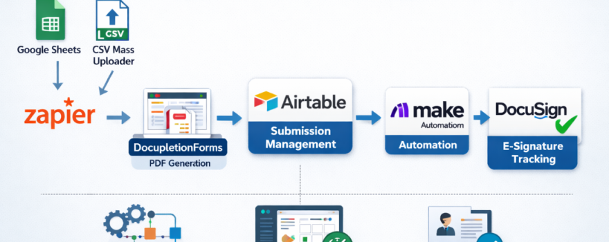
- Bulk lists — Google Sheets or CSV. Generate a lien waiver or notice for every subcontractor on a project in one batch.
The deterministic spine, in field terms: contract type + trade and scope + state + party tier + project stage decides the exact document set, every time.
What the engine can produce
DocupletionForms merges your data into the contract and form templates your firm uses and is licensed for — selecting the correct version for the contract, trade, and state. Note that standardized contract and pay-application forms (for example, AIA-style documents) are licensed through their publishers, and platforms include their own document tools; the value here is conditional selection and assembly across the whole project. A single intake can produce:
- Proposals and estimates with scope and cover pages
- Prime contracts and subcontracts by trade and scope
- Change orders and construction change directives
- Purchase orders and material orders
- Lien waivers selected by state, type (conditional or unconditional), and stage (progress or final)
- Preliminary notices and notices to owner, with their state-specific deadlines
- Pay-application packages and continuation sheets
- Subcontractor prequalification packets, COI request letters, and W-9 collection forms
- Safety documents — job hazard analyses, toolbox-talk forms, incident reports
- Submittal and RFI cover sheets, punch lists, warranty letters, and closeout packages
Where the finished documents go: management platforms
These are the systems contractors run projects on. Each can receive generated documents or exchange project data, with the usual data-versus-PDF distinction: moving record data is one capability; attaching the actual PDF is another, usually via API or a connected store.
- Procore. The dominant commercial-construction platform, with a native Zapier app connecting thousands of apps, a full API, and an App Marketplace. The strongest integration anchor for commercial general contractors.
- JobTread. A budget-first platform with a rich Zapier app (triggers for jobs, documents, and change orders; create-job and upload-file actions), an open API, and QuickBooks and CompanyCam ties — a strong fit for GCs and remodelers.
- Jobber. Home-service and trade software with an open API and broad Zapier support, good for smaller trade and service contractors.
- JobNimbus. Roofing- and exterior-focused, with a Zapier integration plus QuickBooks, EagleView, Beacon, and CompanyCam — the natural anchor for roofing contractors.
- Contractor Foreman. An affordable all-in-one with Zapier plus native QuickBooks, Xero, Procore, DocuSign, and CompanyCam integrations — broad coverage for smaller teams.
- Knowify. Built for trade contractors in electrical, plumbing, and HVAC, with deep QuickBooks integration and Zapier connectivity.
- Houzz Pro. Design-build and remodel software with proposals, selections, and a Zapier integration — suited to residential remodelers.
- Buildertrend. A leading residential home-builder and remodeler platform with QuickBooks and Xero sync and construction-specific integrations; reach it through those connections or its API.
Signature and storage
Many platforms include e-signature, but where you need a standalone signer, DocuSign and Dropbox Sign are the common choices. For the file itself, the reliable cross-platform pattern is to generate the PDF, place it in a connected store — Dropbox, Google Drive, Box — and either link it on the project record or push it through the platform’s API. Do not assume a one-click “attach PDF” action exists everywhere; it does not.
Connection patterns to choose from
1. Zapier, no code
Procore, JobTread, Jobber, JobNimbus, and Contractor Foreman all publish Zapier apps, so a new job, a created document, or an approved change order can trigger DocupletionForms to generate the matching paperwork, with Webhooks by Zapier bridging anything without a native step. The fastest path to a working prototype.
2. Direct webhook or API
DocupletionForms sends submission data and document links straight to a platform’s API — Procore’s API, JobTread’s open API, or Jobber’s API — or to a custom endpoint. The most direct option when a developer is available.
3. Accounting-originated
A draw or vendor record in QuickBooks feeds DocupletionForms to generate the pay application and the matching lien waivers, which return to the platform and the accounting file — mirroring how contractors already run billing through QuickBooks.
4. Salesforce-native
For larger contractors running Salesforce, DocupletionForms’ live Salesforce add-on pushes both the data and the documents onto the record directly — useful where preconstruction and CRM live in Salesforce.
5. Staff-review gate
Insert a human checkpoint: a project manager confirms the state, contract type, and amounts, sets the status to approved, and only then does generation fire. Prevents a wrong-state lien waiver or mis-scoped change order from going out — the kind of error that costs payment rights.
By role and trade
General contractor: project and vendor data produces subcontracts, change orders, purchase orders, and the lien waivers collected from each subcontractor at each draw.
Subcontractor / trade: scope and contract data produces proposals, COIs, the lien waivers issued to the GC, and pay applications.
Residential remodeler / home builder: project and selection data produces proposals, selection addenda, change orders, and warranty documents.
Roofing / exterior: job and material data produces proposals, material orders, completion certificates, and warranty letters.
Commercial / specialty: project data produces submittal and RFI packages, prequalification packets, and safety-compliance documents.
A sensible first build
Strongest first MVP: automated lien waivers. Wire one platform — Procore or JobTread via Zapier — so a draw or payment event generates the correct waiver for each party: the right state form, conditional or unconditional, progress or final. Lien waivers are the perfect determinism showcase because the form is fully dictated by data, the stakes (payment rights) are high, and the manual version is error-prone. Prove that loop and the rest of the document set follows the same pattern.
The connective tissue, briefly
Three pieces do the plumbing. Webhooks push and receive events the moment a job, document, or change order changes. Zapier links thousands of apps with no code and bridges anything lacking a native step. And the platform’s own API or e-signature pipeline is how the finished document reaches the project record and the signer. DocupletionForms sits in the middle as the deterministic engine that turns project data into the correct, complete document set.
If contract, change-order, and lien-waiver paperwork is slowing your projects down, this is a pattern worth prototyping. Start with DocupletionForms as the document layer and connect your construction platform around it.